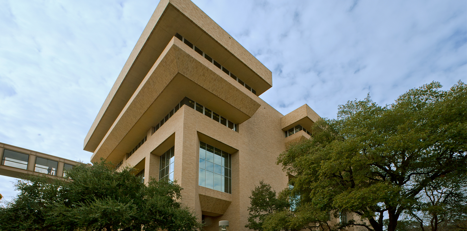
In June of 2007, the Texas A&M University Libraries embarked on a journey to “re-imagine” its physical spaces from the user’s perspective. With a population of almost 50,000 students, the goal from was to design student-centered learning spaces on the first floor of the main facility -?the Sterling C. Evans Library.
To ensure student input they began with an extensive outreach campaign. Large “If I ran the library…” posters and accompanying floor plans were hung in strategic areas on the first floor of Sterling C. Evans Library where the renovation was to take place. This information was also replicated on the Libraries’ website. Students were encouraged to draw their ideas and comments on the floor plans. Based on the initial feedback, a series of increasingly focused questions were posted for additional input and clarification. The outreach campaign culminated with several focus groups.
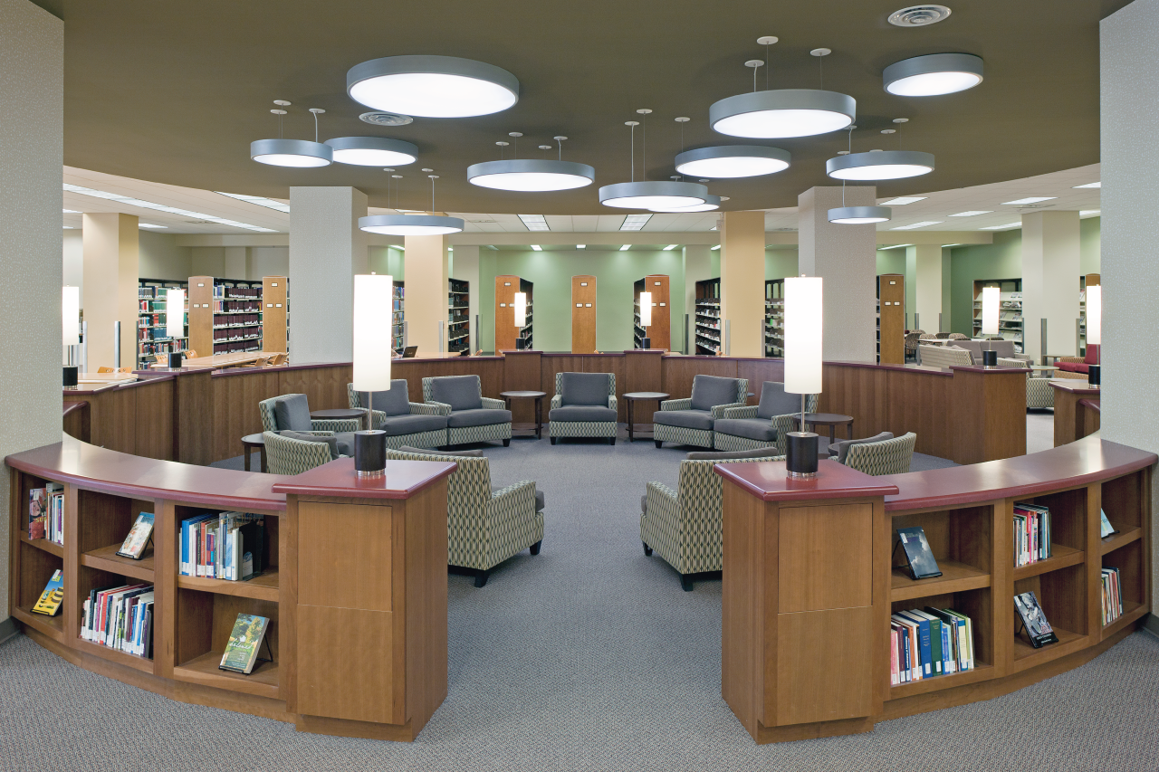
The outreach campaign indicated that the students desired aesthetically-pleasing group and quiet study areas, comfortable, ergonomic seating and work spaces, expanded access to our popular coffee shop and easier access to service staff and expert librarians. Design elements such as improved lighting, warmer colors, and soft textures were incorporated to create more “inviting”, “comfortable”, and “welcoming” spaces -words that regularly emerged from student comments and focus group discussions.
The newly redesigned first floor moves from highly interactive areas with the coffee shop, service desk, and collaborative group areas to quiet and reflective study areas as a user moves further into the building. Overall design took into consideration the need for flexible furniture and collaborative areas, where possible, with intuitive access to services and expert help. The completed project includes the following highlights:
- A consolidated service area for one-stop circulation, interlibrary loan, and reference assistance.
- Custom designed research consultation workstations to better accommodate librarian and user collaboration adjacent to the new service desk.
- An expanded and integrated cafe with an additional 70 seats.
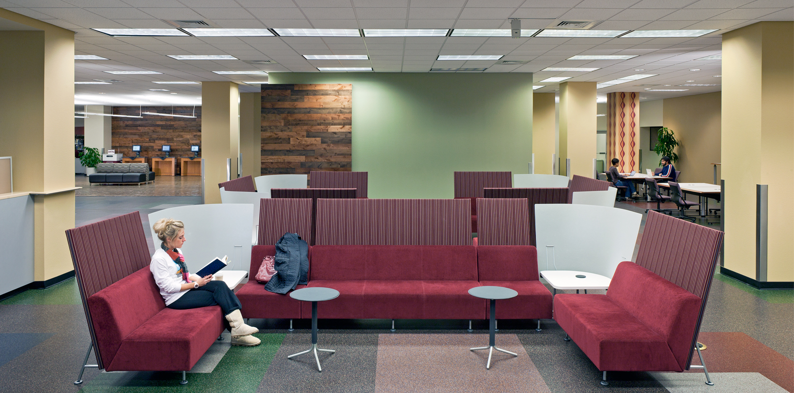
- Twelve new large study rooms for collaborative work and presentation practice. Seven of these rooms include wall-sized whiteboard areas.
- Flexible study booths for additional group study space.
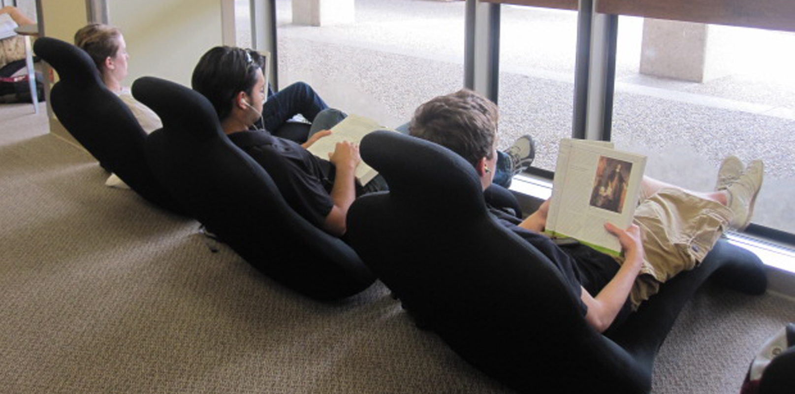
- Comfortable and quirky lounge furniture in the form of human-shaped deck chairs.
Re-imaging the library from the user’s perspective was our guiding principle throughout the project. We achieved this goal by actively encouraging student participation in the design process instead of making our own assumptions about student needs. Our new spaces allow for increased collaboration between students as well as between students and librarians. In addition, the comfortable, attractive spaces and furnishings offer a welcoming experience for all users.
Listed in online Library Design Showcase 2011 by American Libraries Magazine published by ALA


